
Student Org Finder - Design Exercise
“Design an experience for new students to browse, search, and propose new student organizations. Provide your overall process, a wireframe flow, and one to two screens at higher fidelity.”
Skills: User Research, User Interviews, UI/UX
Tools: Sketch, AdobeXD, Photoshop

Challenge
Upon arrival to a new campus, learning about new student organizations is an exciting process, but finding the one that appeases every student’s need and interest can quickly become overwhelming and time-consuming. Especially for those who want to create a new organization, they not only have to process the climate of existing organizations, but also undergo a bureaucratic path with arguably more uncertainties, which can be daunting.
While large number of student organizations in school can be a testament to community’s diversity of interests, the sheer number itself becomes an obstacle for the students to find a community of their interests. This is the gap I sought to bridge: the one that stopped people who want this experience from actualizing it. The following sections will show the process behind my design.
*Note: because I found college students, especially during and after their orientation period, have the most difficult time deciding on which student organizations to join or propose, I conducted this exercise with the intention that this final product will be for the college students. I decided to primarily focus on the experience of Brown University students whom I have the most access to.
Online Research
I first asked myself several questions in order to understand the relevant background, and sought for answers in various literature and research studies posted online.
In college, how many students get involved in a student organization? How “big of a thing” is it?
No specific number, but conservatively estimating, majority of students in the U.S. become involved in student organizations in one way or another during their time in college (based on statistics used in multiple studies related to how student involvement on campus affects college student experience).
Why do students join student organizations?
To improve their communications skills.
To enlarge their communications network.
Why do students not join student organization?
Lack of time.
Haven’t found a group that they could click with.
In terms of students’ years, who are the most active and the least active in student organizations?
Surprisingly, sophomores are most active & juniors are the least active.
Are number of student organizations increasing? decreasing?
At Brown, total funding given for student organizations has increased overtime due to rising number of organizations and inflation.
Takeaways: Given both the increasing demand and legitimate motivations for students to join and create a new student organization, it is clear that there exists a niche for an app that makes actualizing the experience easier and quicker for those who wish to have it. This led me to inquire what is the already-existent system and what are the ways students actually use to discover/start student organizations—if they are any different.
User Interview and User Research
Starting the process of getting actual qualitative input from users, having access to a large pool of users I wanted to design for (namely, first-year new students discovering multiple organizations during the orientation period; second-year students still looking for a student organization to be an active member in; and students in any year planning to create a new organization) was convenient given my proximity to campus. I executed this by talking in person to several people I knew in my network, a lot of which happen to fit this demographic not too long ago.
Specifically, I wanted to find out:
The process starting from how students typically first learn about student organizations on campus all the way up to joining one of them.
What students find most important when considering to join a student organization.
The biggest hassle of finding a student organization, and what students do to assuage it.
The biggest hassle of creating a new student organization, and what students do to assuage it.
Things they would want to change about the experience of discovering or creating organization in general.
Surprisingly, among several I interviewed, only two students used BearSync, the Web Application provided by the University that lets students browse and search student organizations. Among those two, one of them didn’t even know it existed until she had to submit her application for creating a new organization via BearSync, and never used it afterwards. Both students did not find it useful because it neither had the most updated information nor a user-friendly UI. One of the students stated, “You have to know what you’re looking for in order to find the organization.”
I found that most people currently discover student organizations the following way, as shown from step one to four, with priorities listed in step two—and if necessary, create a new organization as shown from step five to step nine.

FINDING THE PROBLEM
Based on the information gathered from the online research and the user research, we should take a look at the issue at hand and break it down to its root cause(s).
We want to make it easier for students to find and propose student organizations. The underlying problems are that
1. When exploring organizations, many students, especially first-year students, don’t really know what they are or should be looking for.
2. Many students don’t have enough time to look through hundreds of student organizations.
3. The means in which students get exposed to organizations (i.e. the once-a-year Activities Fair and word of mouth) are limited and happens very few times. During those few times, students face to process too much.
4. Any process that involves too many steps (i.e. applying for creating a new organization) can lead anyone to miss a step.
SOLVING THE PROBLEM
Keeping these things in mind, I decided on the following mission statement:
Get students to have easier, quicker time finding and proposing their perfect student organization.
This will be achieved through these four goals:
Give guideline for students that let them reflect their interests and needs.
Highlight the most important information about the organizations.
Provide additional way (i.e. other than the Activities Fair) that doesn’t cost too much for students to learn about organizations.
Help students be on track.
One of the students’ quotes nicely sums up the spirit of this mission: “I wish a perfect club for me would show up.”
Sketches of Wireframes
I decided to create this as a Mobile App for mainly two reasons: 1) Students learn about organizations in a conversational-setting the most. Mobile App is the most convenient way for them to look one up on the spot. 2) Notification features will help students be on track for either their application process for creating new organization or events that they wanted to check out. The needed features, actions and pieces of information were already pretty clear after the phases above, so I could jump straight into a quick sketch to map out the user flow. I tried to put in all the features I was planning, and most of it felt logical at this point.
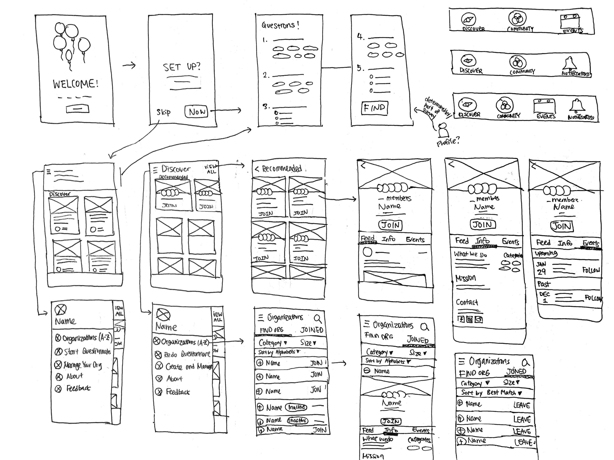
After a couple of paper, I had the general idea ready. I then switched to Sketch, where it’s easier to move things around.
Wireframe Flow
This was the final result of the user flow after a couple of iterations in Sketch.


Since we don’t have a lot of top-level views, I opted for bottom navigation with 4 views:
Discover: contains a preview of organization recommendations and randomly-generated posts from all organizations.
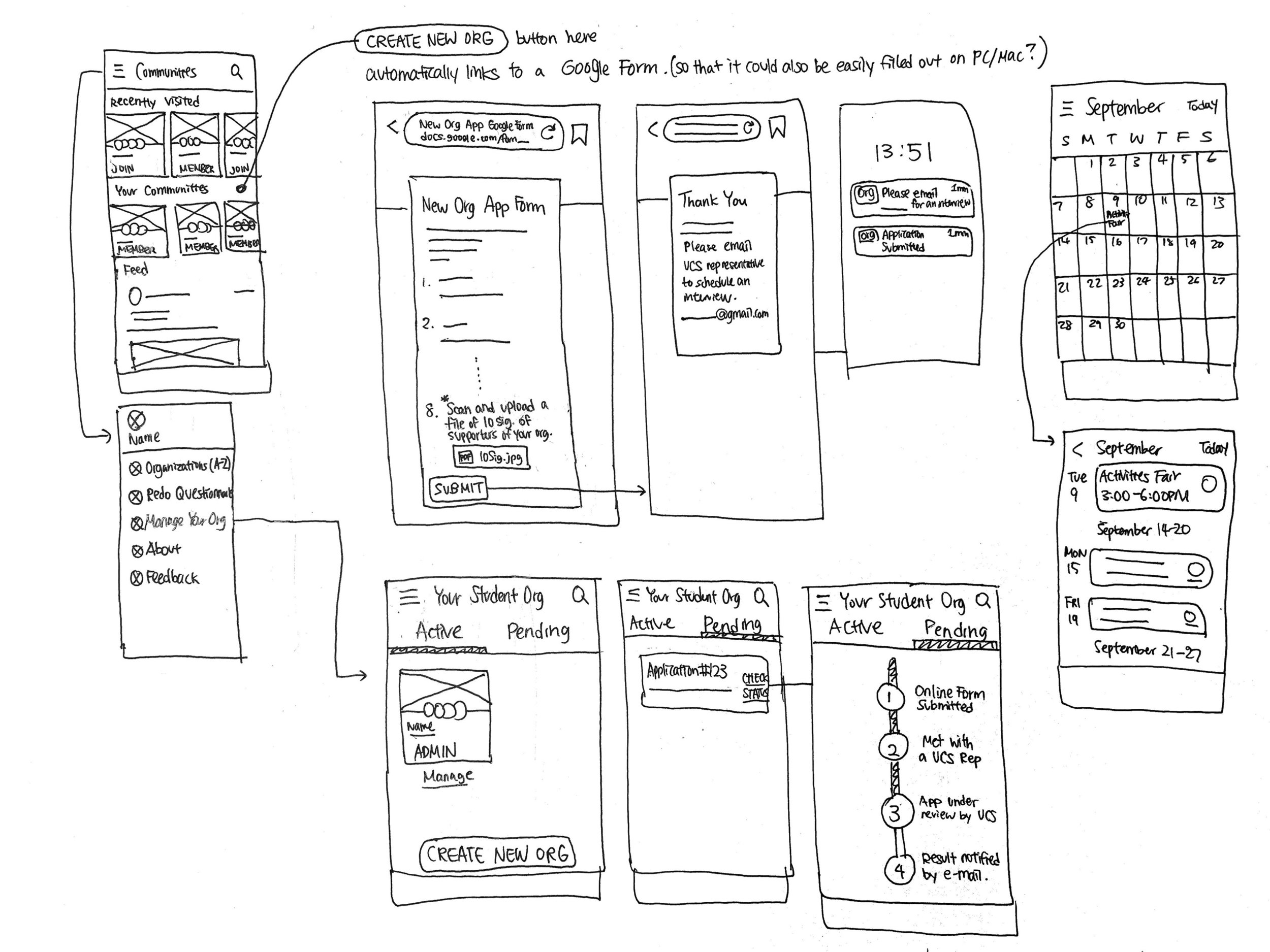
Communities: contains organizations that a user decided to join and a News Feed generated only by those organizations.
Calendar: contains events hosted by organizations that a user decided to join.
Notifications: contains alerts regarding application process and reminders about events.
Each tab represents a different cycle in the users’ progress toward finding their perfect organization, and as the user gets closer to their goal, the user moves through the navigation from left to right.
I won’t go into detail for picture viewing, adding events to calendar, and settings since they work pretty much the same as in every other app.
Notifications are something that could be easily forgotten in this case, but I believe this is one of the most effective features that will allow more students to successfully complete their application for creating a new organization. With this notification, we can prevent students from forgetting about the next step—such as, the fact that they are expected to email the UCS Representative after they submit the online application form—in a process that is already convoluted enough for them to follow. Furthermore, speaking of the online form, I believed that external Google Form was necessary because it would be difficult for users to type out answers for multiple questions on their phones. These decisions go a long way towards achieving goal #4.
Going into detail for the two most important parts in the user flow:
ONBOARDING

The welcome screen is pretty standard. The welcome screen is pretty standard. It features a big app icon (preferably animated) to reinforce branding and add some visual delight to the user’s first contact with the app. It also repeats the value proposition which explains the user why it’s worth it to complete the questionnaire.
The questionnaire itself is equally simple. Each page has a big question at the top and multiple options below. After user picks options, they can press on the right arrow to answer the following question, or the left arrow to go back to change their answers. This process will directly execute goal #1 and bring the user closer to re-orient themselves with their interests and needs.
If the user presses the Skip button on the welcome screen, they immediately get the grid-view of posts from all organizations, which feels less personalized. As long as the user has not completed the wizard, there is an inline card that repeats the value prop and urges the user to answer the questions.
DISCOVERING

The Discovery page mostly consisted of randomly generated posts written by all organizations. It was designed as a virtual form of what students experience at the Activities Fair—a massive load of information, but also the mean where students learn about the highest number of organizations. This decision executes goal #3.
Further, because we also want students to feel less overwhelmed in such similar setting, I opted to put the recommendations on top of the randomly-generated feed. This will be the first screen they see after they complete the questionnaire, having a more personalized feel.
Once they browse through recommended organizations in a grid-layout, when users click on one organization, there will only be the highly-desired information laid out on the landing information page: what the organization does, mission, contact, and members. This design executes goal #2.
Further, every time user joins an organization, the organization gets added to their Communities page. This allows the user to filter information from only the organizations that they are interested in—giving users the power to form the communities that they feel like belonging in.
Most importantly, at all times, user has the option to filter organizations by category and size. At the Recommended Organizations page, it intentionally does not give all the categories available to the students in order to prevent information overload. The given categories are chosen based on the answers to the questionnaire.
If the user wishes to access the entire categories and the entire organizations, at any point, they can click on the hamburger menu on the top left to access both as shown below.

High Fidelity


I chose this particular shade of brown and red for the main color scheme because our university logo is consisted of those colors. Because of this familiar color scheme, the students will feel comfortable and relatable from the moment they open the app and start the questionnaire. Each organization card has a different background color to promote individuality, and all of those colors are intentionally vibrant, so they provide a welcoming and exciting feeling to the new students.
Takeaway
Designing an experience within one week is challenging. However, it was a great learning opportunity on how to quickly identify the needs, have clear goals, and act fast. Additionally, designing for someone who is very close to my community is a very enjoyable and humbling process. Although it was a time-pressing process, I really had a lot of fun every moment of it.