F L Y T E
“The most reliable travel buddy—from the moment you purchase your flight ticket until you arrive at the destination.”
Skills: UI/UX Design, Visual Infographics, Interaction Design, Collaborative Design
Tools: Figma, AdobeXD

Context
In this 3-week project for a UX/UI course under the Graphic Design Department at Rhode Island School of Design (RISD), I worked collaboratively with 2 other students in class (Javier Syquia and Wynn Geary) to develop an application concept from the ground up. Design decisions were made using the joint efforts of the team and, wherever possible, we collaboratively conducted research, user testings, and gathered feedback to drive the direction of our final product. Before we started, we knew we wanted to tackle on improving travel experiences for modern users.
Project Timeline
Week 1: Each group member independently studied a particular user journey to identify design opportunities.
Week 2: We started consolidating our ideas into a single product direction. This week covered developing the strategy and scope, brainstorming a preliminary structure and sketching skeleton ideas independently using the parallel design process to bring our ideas together and consolidate the design.
Week 3: On the third week, we tested our ideas, finalized the design, created a visual brand and style guide, and finalized the app’s prototypes.
Survey Findings
We shared a Google Form survey to on online platforms such as Facebook, Instagram and reddit.

We noticed how much product and services exists to help plan and alert the best deal for transportations (e.g. flight) and lodgings. However, there is a gap in the flow between—the moment you book flights and the moment you arrive at a destination.
User Interview Insights
We conducted user interviews with several individuals with different level of travel frequency.
There is a wide range of users especially when it comes to planning.
Type A: “I am concerned if I don’t plan everything to every single minute.”
Type B: “I don’t look up terminals.”
Among those who do some amount of planning before planning…
“It’s something I have to figure out and just do it”
They are afraid that they are going to forget something on the day of travel.
They wish there was a “plan everything for me!” type of service.
Primary concerns on the day of flight:
Uber, gate changes, any sources that might cause delay in getting to the gate.
Flight delays are the primary concerns once at the airport.
Transportation from the destination airport to the place that they have to go next upon arrival is the most ambiguous.
Problem Area
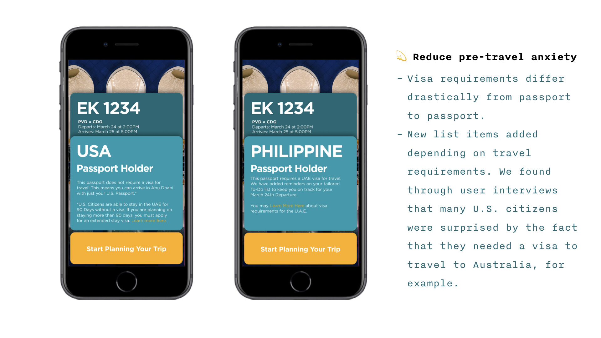
💫 Pre-Travel Anxiety
Very a common and complex issue, causing people to feel anxious or depressed when preparing for a trip and the subsequent weeks leading it up to it.
💫 Forgetfulness
Especially when feeling rushed, many people tend to leave things behind.
Constant feeling of "Why do I feel like I am forgetting something."
💫 Lack of sense of security
Anything can go wrong with this trip, and not knowing everything you need to know about your flight can make you feel out of control.
Persona
Regular travelers heading to a new destination
They are somewhat comfortable with traveling, but unsure about how to go about planning a trip to a completely new destination.

User Journey Flow
Based on the user persona, we began to construct the user journey flow. This allowed us to locate the potential sources of frustration for users and identify the necessary features to implement in our app to solve this problem.

Now that we had an idea for user flow journey, it was time for us to start sketching out the layout we were envisioning.
Sketches + Lo-Fi

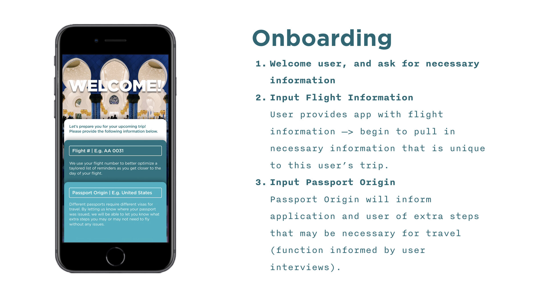
Onboarding
Onboarding v1: Build-up of information that will be asked of user.
Onboarding v2: Show all information that the user will need to input from the start.
Why v2?
Only two input fields
More transparent to the users

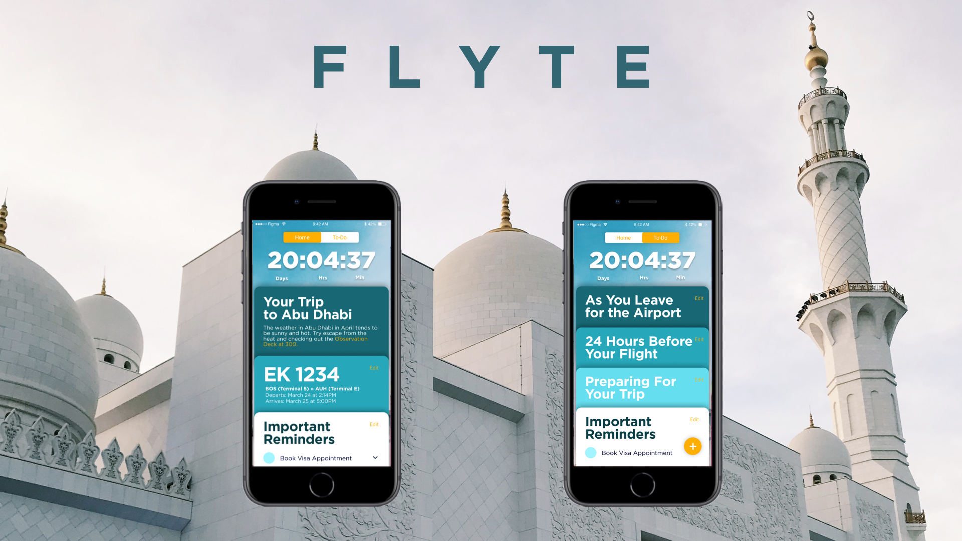
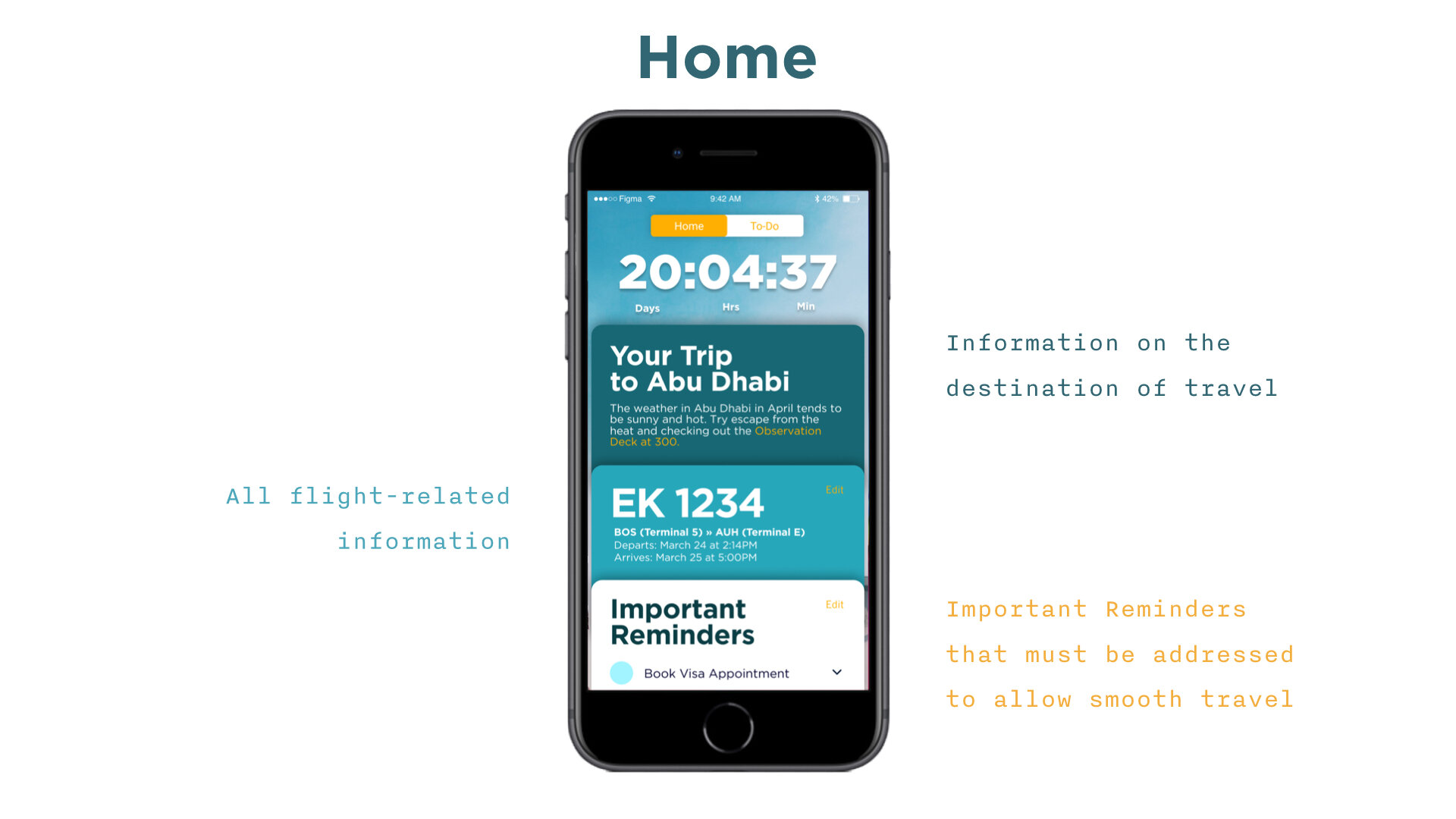
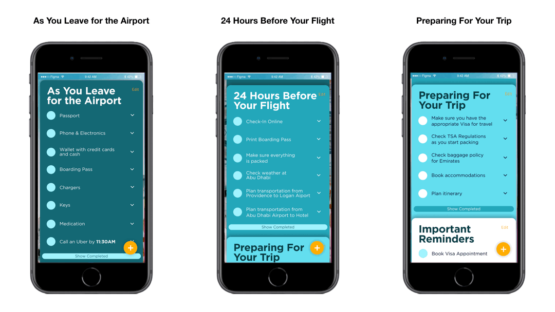
Primary Layout
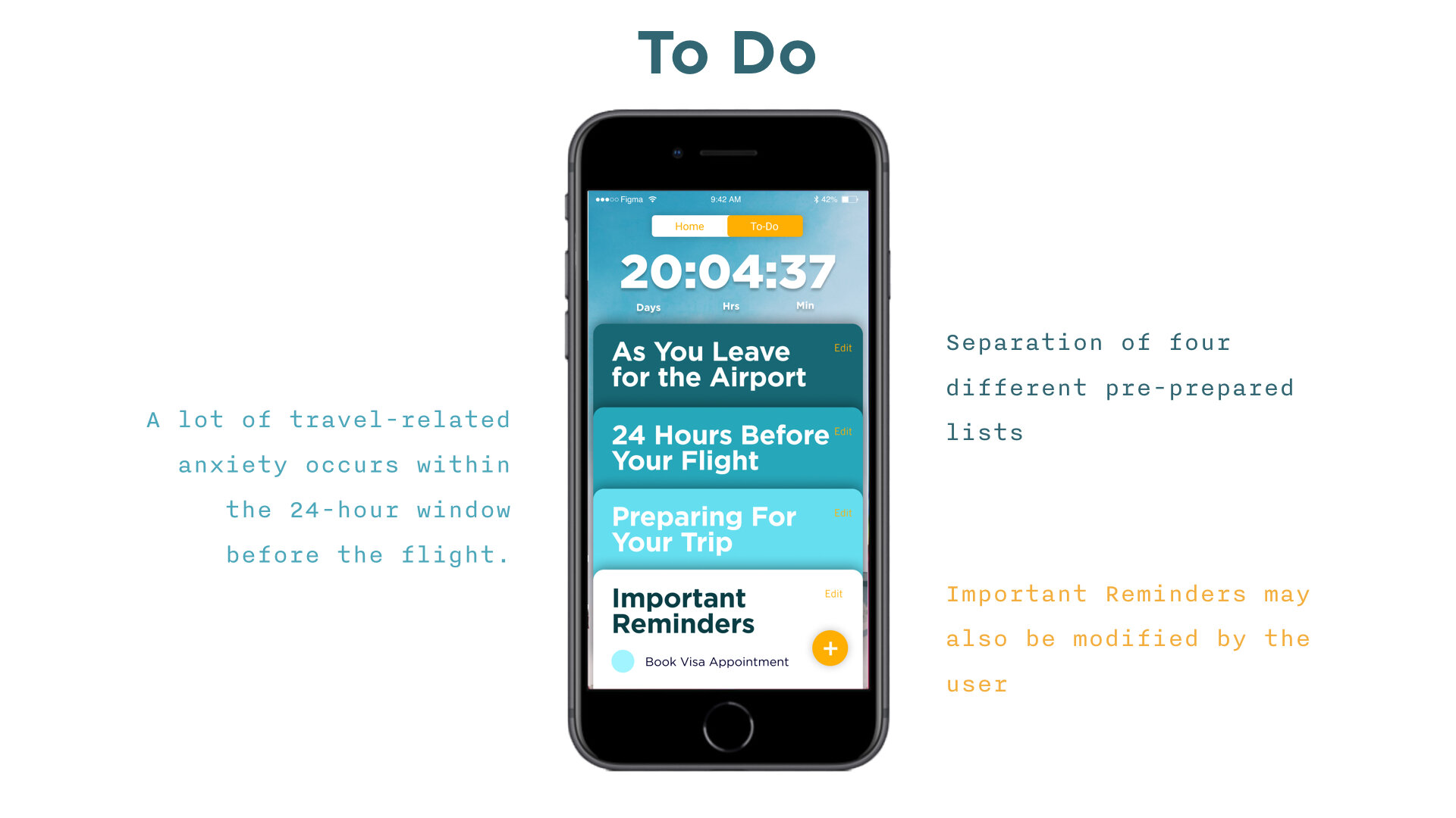
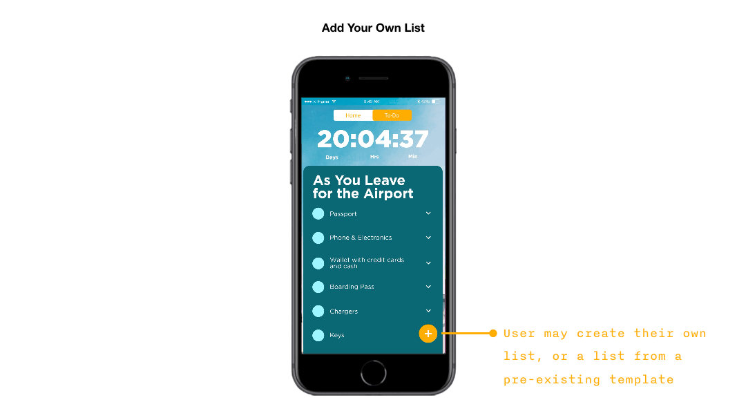
Two Screens: Home + To-Do
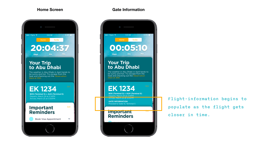
Each screen has a layout of cards divided by time by default
(answers the question by users, when do I need to figure out “X” by? X could be scheduling appointment for visa interview, booking lodging, etc.)
The most time-sensitive card is stacked on the top
Style Sheet
Shades of blue were chosen as our main branding colors because blue evokes images of the sky and ocean during the flight.

Hi-Fi Mockups
After finishing the style guide, we sketched out a couple of initial wireframes and added our colors to see how it looked in real life application. We wanted to make sure our branding was communicative of our app and that the visual language extended into the app itself.

Hi-Fi Touchpoints
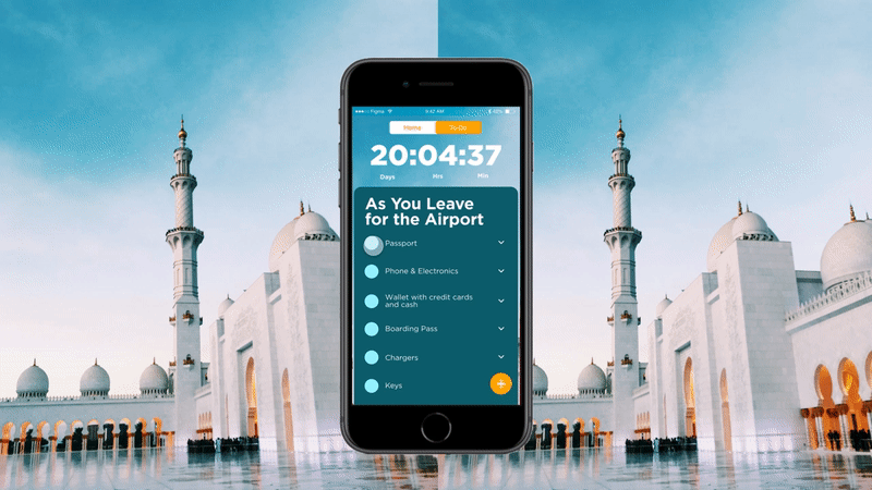
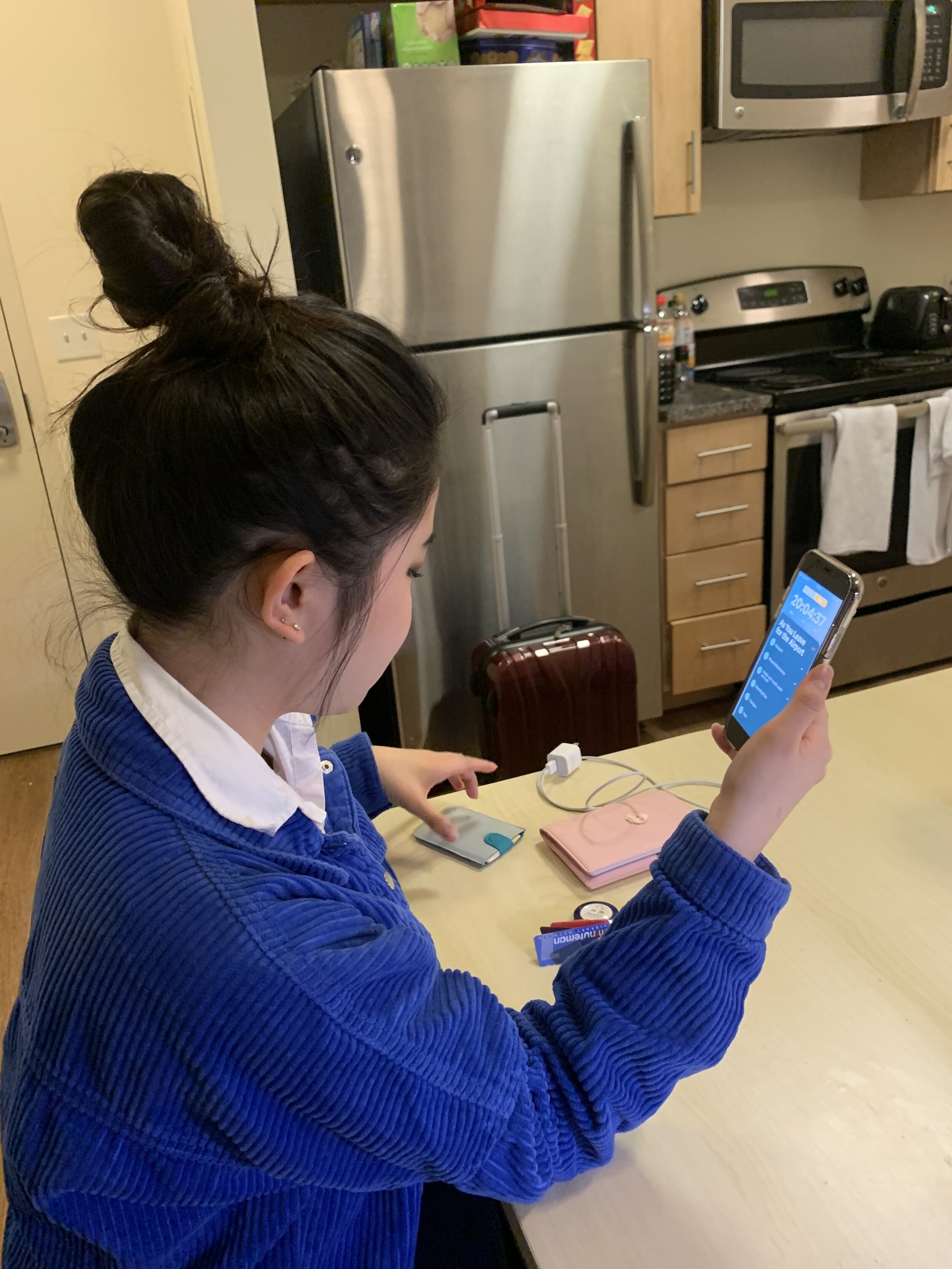
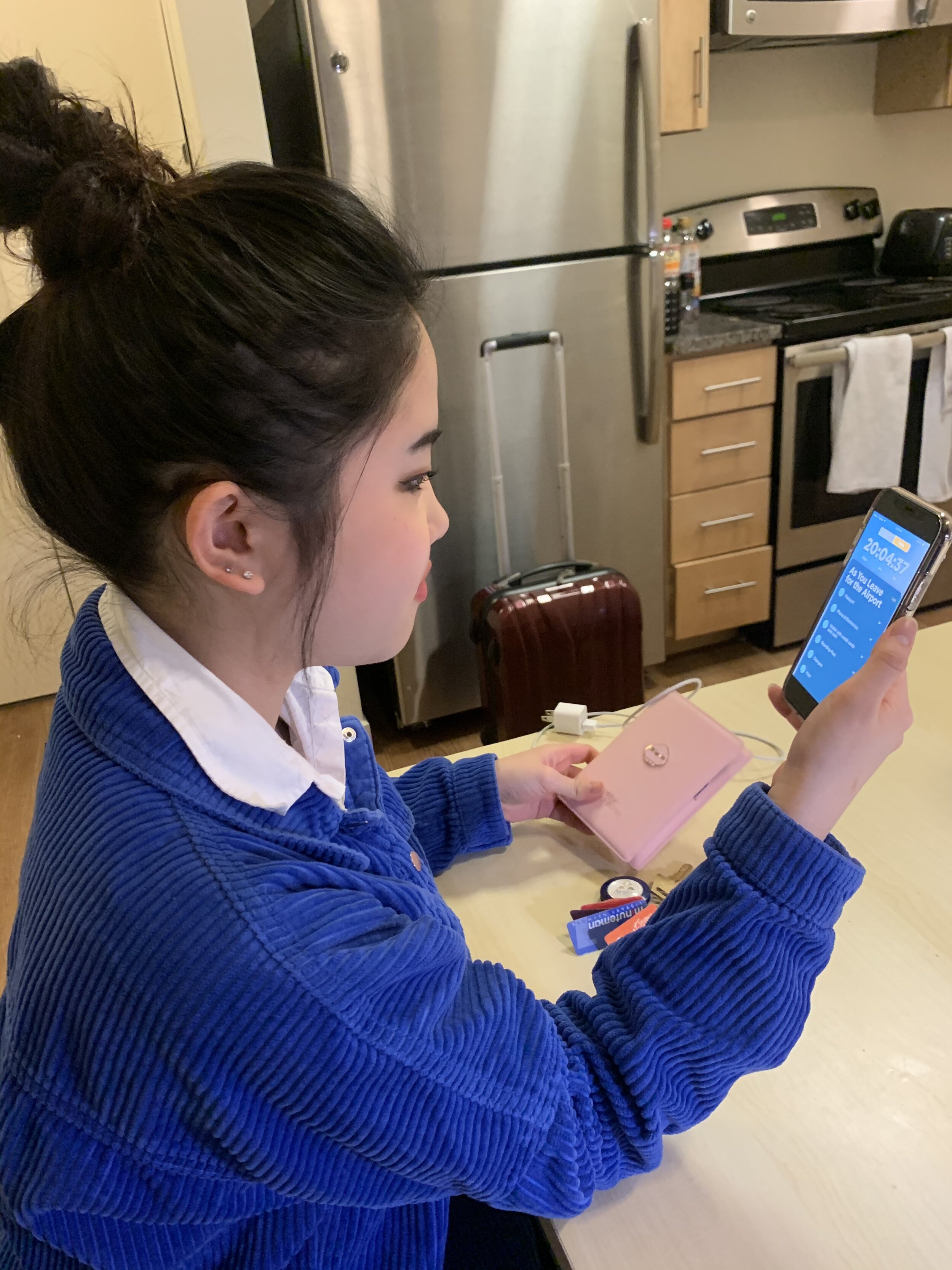
The following are key moments within the experience of FLYTE.
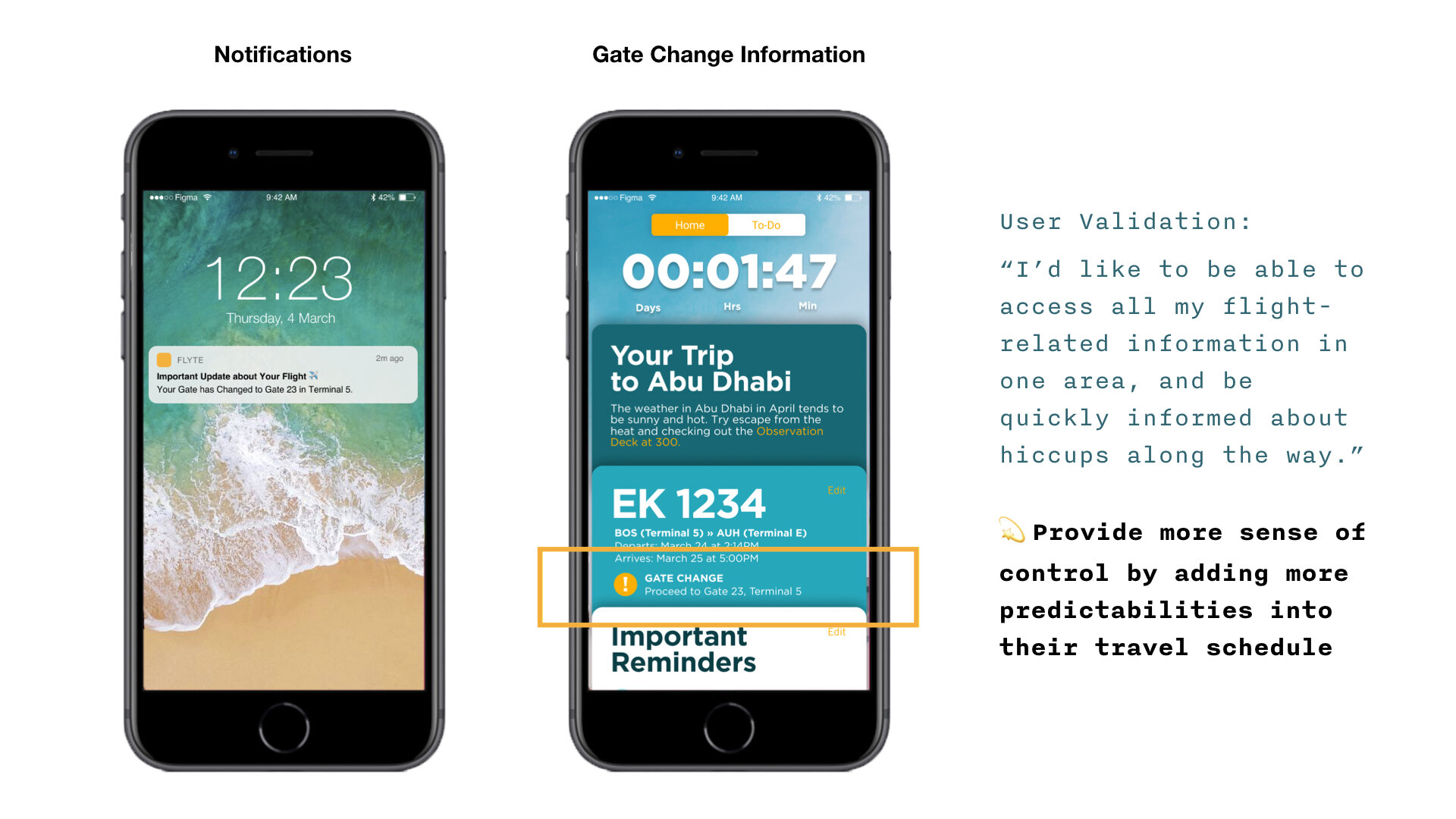
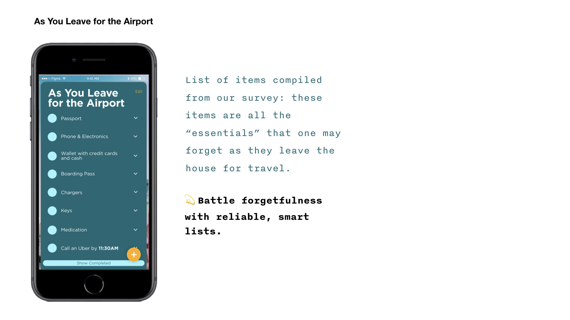


We asked one of our friends to go through the “As You Leave for the Airport” list before she travels for spring break. We wanted to validate the order of the cards (“As You Leave For the Airport” on the bottom of the stack vs. “Important Reminders” on the bottom of the stack). A single tap of the top item during a time when the user had to multi-task was reported to be more convenient and quick a scroll.
User Testing
FLYTE is not for everyone. FLYTE is for those who have experienced difficulties with their visa requirements, battle with the constant sense of forgetting something, and really do not appreciate unpredictable factors in their travel journey. FLYTE improves their lives by reducing their anxiety by laying out what they need for their visa based on their passport origin, keeps them on their toes through smart lists and notifications, and gives them more sense of control throughout their travel journey by knowing that they will be notified if there are any surprises. It was a valuable experience to identify a gap in already saturated market, and design for a niche population and prioritize on their specific frustrations.
